flex-flow: flex-direction flex-wrap ;
Q20.
The two properties flex-direction and flex-wrap are used so often together that the shorthand property flex-flow was created to combine them. This shorthand property accepts the value of the two properties separated by a space.
For example, you can use flex-flow: row wrap to set rows and wrap them.
Try using flex-flow to repeat the previous level.

#pond {
 display: flex;
 flex-flow: column wrap;
}
해설:
1) 우선 나열된 줄의 축을 바꿔준다(flex-direction의 디폴트 값은 row, 즉 column으로 변경)
2) 한줄안에 가득 찬 개구리들이 일정 간격으로 펼쳐져 아래 줄로 떠어질 수 있도록 한다 (flex-wrap의 디폴트는 no-wrap, 즉 wrap으로 변경)
Q23.
The frogs have had a party, but it is time to go home. Use a combination of flex-direction and align-content to get them to their lilypads.
align-content: This aligns a flex container’s lines within when there is extra space in the cross-axis, similar to how justify-content aligns individual items within the main-axis.

해설:
1) Flex 방향을 세로줄(column)로 바꿔준 후 방향을 뒤집는다(reverse). flex-direction: column-reverse;
2) 메인축이 세로로 변경된 상태에서(align-content) 가운데로 정렬(center)한다. align-content: center;
#pond{
 display: flex;
 flex-wrap: wrap;
 flex-direction: column-reverse;
 align-content: center;
}
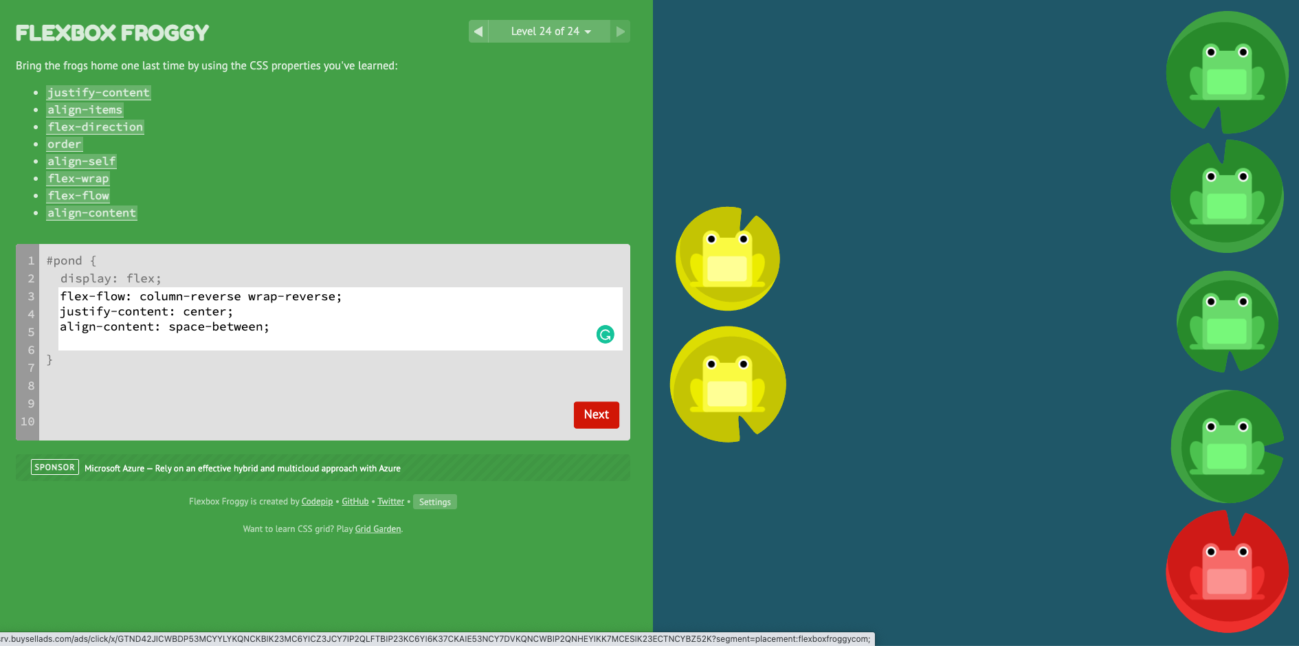
Q24.
Bring the frogs home one last time by using the CSS properties you've learned:
- justify-content
- align-items
- flex-direction
- order
- align-self
- flex-wrap
- flex-flow
align-content:
This aligns a flex container’s lines within when there is extra space in the cross-axis, similar to how justify-content aligns individual items within the main-axis.

#pond {
 display: flex;
 justify-content: center;
 flex-direction: column-reverse;
 flex-wrap: wrap-reverse;
 align-content: space-between;
}
그런데 flex-flow: flex-direction flex-wrap 표현이 가능하므로
최종 css코드는,
#pond {
 display: flex;
 flex-flow: column-reverse wrap-reverse;
 justify-content: center;
 align-content: space-between;
}
정답 화면)
참고자료:
[1] 이 게임을 하고 싶다면, http://flexboxfroggy.com/
Flexbox Froggy
A game for learning CSS flexbox
flexboxfroggy.com
[2] 이쁘게 정리된 영문을 보고싶다면, https://css-tricks.com/snippets/css/a-guide-to-flexbox/
A Complete Guide to Flexbox
Our comprehensive guide to CSS flexbox layout. This complete guide explains everything about flexbox, focusing on all the different possible properties for the parent element (the flex container) and the child elements (the flex items). It also includes hi
css-tricks.com
'Frontend > HTML, CSS' 카테고리의 다른 글
| [HTML] 절대경로(Absolute path)와 상대경로(Relative path) (0) | 2021.10.22 |
|---|---|
| [HTML] IE 호환성 크로스 브라우징 (Cross-browsing) (0) | 2021.10.22 |
| [HTML] 반응형 웹 (Responsive) 처리 (0) | 2021.10.22 |
| [HTML] <head>안에 들어가는 내용 (0) | 2021.10.22 |
| [CSS] #1-2 박스모델과 box-sizing (0) | 2021.10.13 |